
Livable D.C.
Katie Kunesh (me)
Interactive Data Visualization
August - December 2024
Research
Literature Review
UX Design
Data Visualization
Usability Testing
Tableau, Github, HTML, CSS
Overview
Livable D.C. is a data visualization tool I designed to help users find the neighborhoods in Washington, D.C. best suited for them based on their personal preferences. The project addresses the challenge of finding the right neighborhood in a new city by empowering users to define what livable means to them.
The Problem
Moving to a new city can be stressful. Finding the right neighborhood that aligns with your lifestyle, needs, and preferences adds another layer of difficulty, especially when existing tools for assessing livability do not account for individual needs and preferences. These tools often aggregate data at a city level, overlooking the unique nuances of each neighborhood within a city, which can lead to an inaccurate picture of livability for individuals.
The Goal
The goal of Livable D.C. was to give users control over the definition of livability by providing a personalized experience that allows them to explore and compare neighborhoods in Washington, D.C. at a granular level, using data visualizations to highlight the factors that matter most to them.
Literature Review
The process of creating Livable D.C. began with the inspiration to help newcomers to Washington, D.C. navigate its diverse neighborhoods and a personal interest in learning more about the effects of the built environment on a person’s wellbeing.
Before diving into design, I conducted a thorough literature review, exploring existing work on urban livability and how people define it. This research played a crucial role in shaping the direction of Livable D.C. It revealed that livability is a multifaceted concept, encompassing a wide range of environmental, social, and economic factors.
The literature review also revealed a gap in existing livability assessment tools. While tools like the AARP Livability Index provide broad comparisons, they often lack the customization needed for individual decision-making, and overlook the nuanced variations that exist within a city's neighborhoods. I aimed to address this limitation by focusing on census tract and neighborhood-level data and empowering users to prioritize the factors most important to them. By offering this level of personalization, Livable D.C. would provide more relevant and actionable insights for individuals seeking their ideal neighborhood in Washington, D.C.

AARP's Livability Index for Washington, D.C., found here
Data Source
For this project, I chose to use a dataset that was created for a project titled "Built Environment Indicators and Health - Interactive Map Tool," which focused on the relationship between the built environment and public health in D.C. This dataset uses publicly available data, primarily from Open Data DC, as well as data from the American Community Survey and some data provided by District government agencies. The project team categorized the indicators into nine drivers that encompass various factors related to the built environment: community safety, education, employment, food environment, housing, income, medical care, outdoor environment, and transportation. An additional dataset titled “DC Health Planning Neighborhoods to Census Tracts” was utilized to map census tracts to neighborhoods.
The Process
Research
Identify gaps in the current state of livability assessment
Design
Learn about the data, sketch ideas, and try different layouts
Build
Create a functional and interactive visualization
Improve
Test with target users to identify and solve usability concerns
Sketches
After the literature review, I started sketching my initial design concept. This early stage involved envisioning how users would interact with the tool and how the data would be visually represented. My first sketch featured a choropleth map of Washington, D.C., broken down by census tracts.
To enable user customization, I initially included a series of dropdown menus for each livability category. Users would type in their desired weight for each category, and the map would visualize a livability score based on these inputs. However, I soon realized that relying solely on dropdowns might not be the most intuitive approach, especially with nine categories and the requirement for weights to add up to 100%.


Usability Testing
Once the beta version of Livable D.C. was ready for real world testing, I conducted evaluations with three participants. I observed their interactions with the tool through multiple tasks and gathered qualitative feedback from interviews.
One key finding was the difficulty users faced in ensuring their category weights added up to 100%. To address this, I incorporated a display showing the total weight of their inputs below the category sliders. This simple addition minimized mental math and provided immediate visual feedback. To further streamline the process I added an "apply" button, turning from red to blue upon reaching 100% to signal a valid input.
Recognizing the desire for a more in-depth analysis of individual census tracts, I added a second bar chart that appeared upon selecting a census tract on the map. This bar chart broke down the selected tract by built environment category (e.g., education, transportation), providing a more in-depth view of its livability profile.After all feedback from the evaluations was addressed, the final version of Livable D.C. was completed and published.
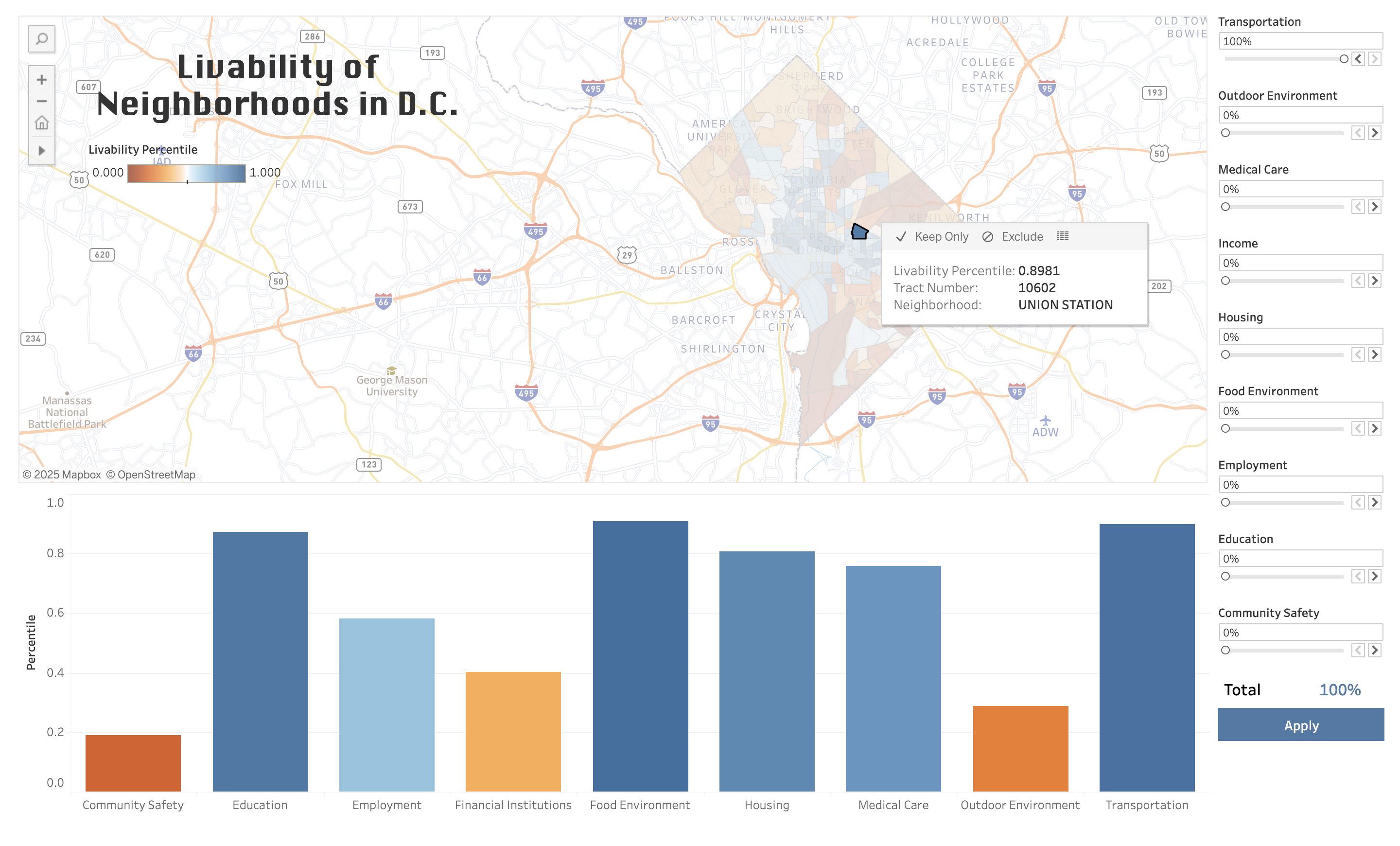
Census tract breakdown for more detailed information
Building and Evolving
As I moved from sketching to building the beta version in Tableau, I made several key design decisions. First, I replaced the dropdowns with sliders, a more user-friendly method for adjusting weights.
Recognizing that the 11-digit census tract numbers alone lacked context, I integrated a second dataset (DC Health Planning Neighborhoods to Census Tracts) mapping each census tract to a neighborhood in Washington, D.C. This addition led to the inclusion of a bar chart displaying the average livability score for each neighborhood based on the scores of the census tracts it encompassed. This dual visualization approach offered users both a broad overview through the bar chart and a more granular perspective through the map, allowing them to connect data insights to recognizable locations.
At this time, I also shifted from a sequential blue color scheme on the map to a diverging blue and orange palette. This change provided better contrast, making it easier for users to distinguish between areas with higher and lower livability scores based on their chosen preferences.

Neighborhood-level bar chart
Final Design
The design of Livable D.C. was an iterative process shaped by user feedback and a commitment to creating a truly useful tool. Its final version offers a visually-appealing, customizable platform for exploring D.C. neighborhoods. You can try this tool out for yourself at https://kkunesh2020.github.io/livableDCDashboard.html

Final release of Livable D.C.
More information about the primary dataset can be found on the project page, and access to the dataset can be found on data.gov. A second dataset, found on data.gov, was used to map the census tracts from the first dataset to statistical neighborhoods in Washington, D.C. as defined by the DC Department of Health.